
There’s nothing more frustrating for website visitors than landing on a site and then not being able to find what they were looking for. The truth is they won’t spend time searching they will simply close out and go on to the next site. You obviously don’t want to lose traffic and potential sales because your visitor couldn’t navigate around your site.
So what to do? What’s the best practice for linking pages and improving the visitor’s experience? Well here are three tips to keep in mind when you are laying out your website design.
What’s Really Important?
The first step in designing an easy to use navigation system is to decide what the main categories are going to be. Some are obvious like home, about us, and contact us; the rest will depend on just what your objectives are. Keep in mind that you have limited space for this “menu” and in any case you shouldn’t exceed eight categories. More than eight categories tend to overwhelm the visitor with choices and odds are they will pick the wrong one.
Once you have your categories selected, draw a quick diagram showing the categories and the pages that will fall under each placing the pages in order of importance. For example under “about us” you may have the page that describes who you are followed by a page like “why use us” and finally a page of “testimonials.”
Web Navigation Placement
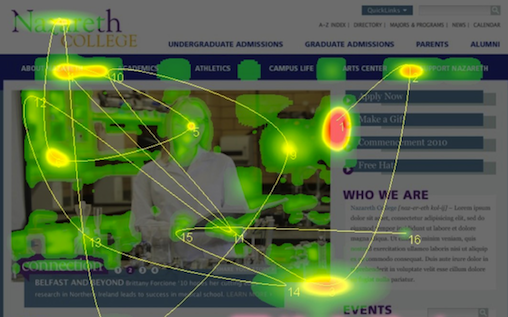
Eye movement studies show that visitors will typically look to the top left when your page comes up. This isn’t really all that remarkable when you consider that’s how we have been taught to read. However it is important in the sense that the top left is a great place to put your menu. Ideally place the tabs directly under the header and run them across the page in order of importance.
If you are using a left panel, run a vertical menu above the fold as a “secondary” navigation tool.
Consider using the footer as a home for a left to right menu particularly if you are heavy in text. This eliminates the need for the visitor to scroll back to the top when they have finished reading your article. The footer is also a good place to put links to important pages that will rarely be viewed like privacy policy and the new FTC affiliate statement.
Help Your Visitors Out
Consider using links to related pages at the bottom of each article. For example if you have a page on “How to Get Rid of Fleas on a Dog” you may want to show a link at the end of the article to your page on “How to Get Fleas out Of Carpets.” Adding related links will increase page views and give the visitor a better experience. Don’t believe it? Just look at any product page on Amazon.com and see how many “related links” there are.
When you add these related links, use clear and concise language as anchor text and avoid using non-descriptive terms like click here. Adding internal links to relevant pages also gives you a bit of a boost in your SEO.
Just remember to keep your navigation simple, consistent and relevant. The ultimate goal is let the visitor find what they are looking for with a minimum number of clicks and without having to scroll all over the site looking for links.